Design and development of the US energy history visualization (2015–2019). This project was a collaboration with the Center for robust decision-making in climate and energy policy (RDCEP) and the Research computing center (RCC) at the University of Chicago.
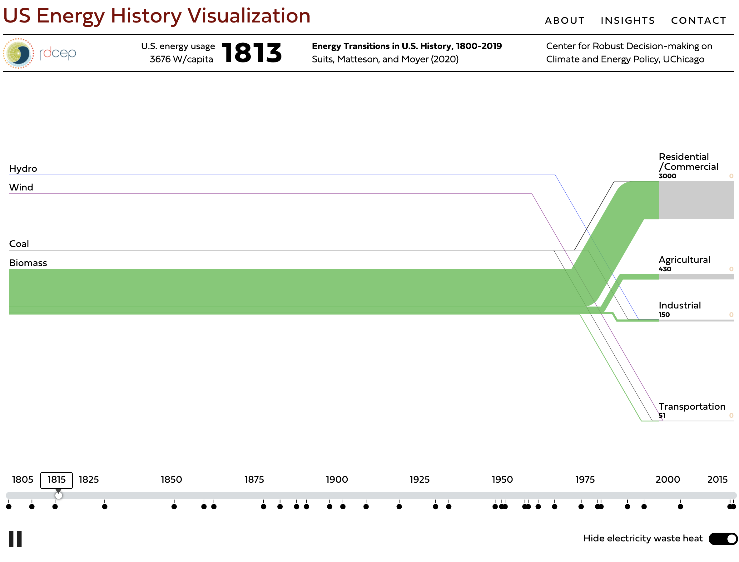
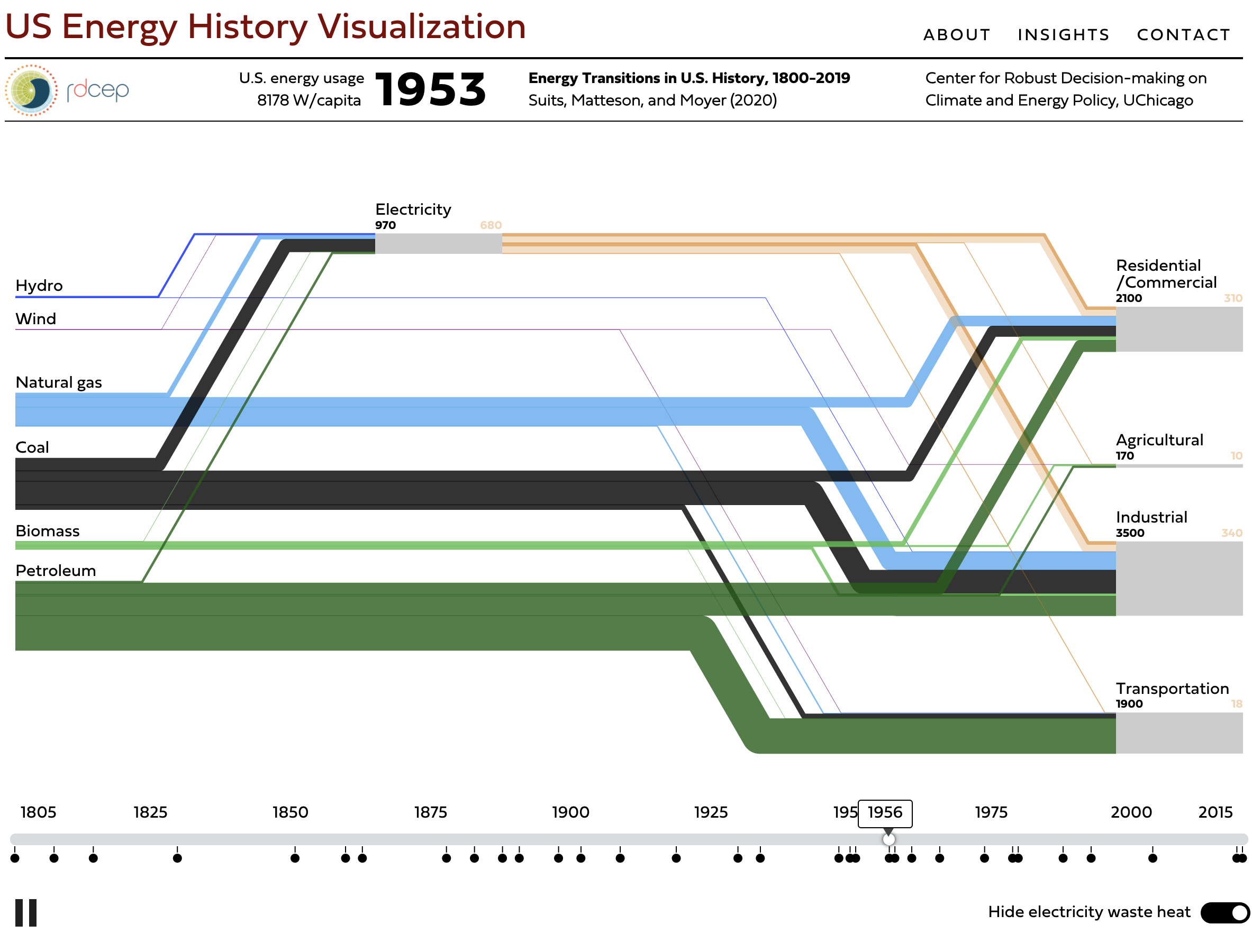
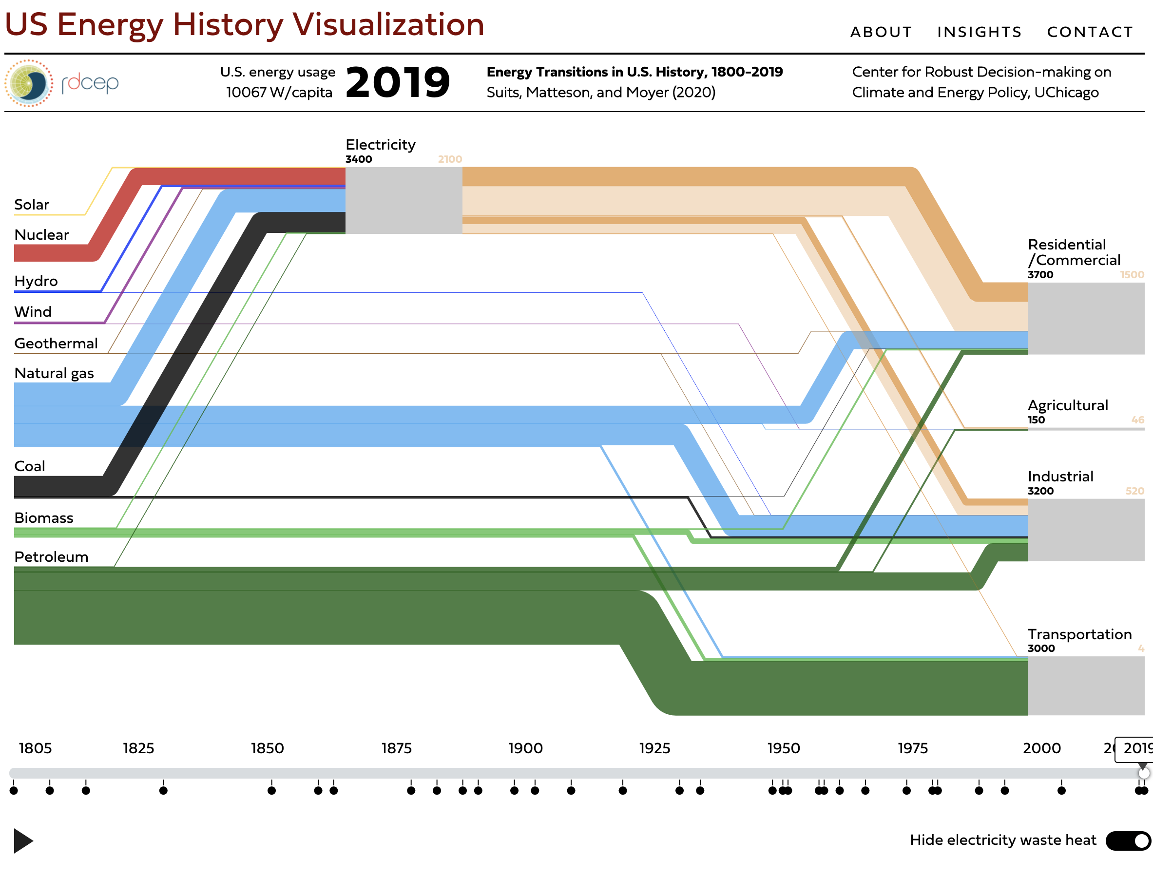
A Sankey graph shows the total energy use in the US across all fuel souces and separated into four sectors of utilization usage. This graph is animated over time—the first animated Sankey that we’re aware of—and shows the transitions, from biomass to coal to petroleum to gas, that have occurred in the US from 1800 to the present.
Future development to support the energy infrastructure of other contries is being planned. Code for the original Sankey animation is available here: github.com/rdcep/sankey-timeline.